World Happiness Report
Project: Visualization of the World Happiness Report data with a focus on the US
Elements: Visual Design | Data Wrangling | Tableau
Where: Parsons School of Design - Infographics and Data Visualization Certificate
Summary
Is the "greatest" country in the world also the happiest country in the world? This project takes the data from the World Happiness Reports from 2015 to 2021 and visualizes how the United states actually compares to the rest of the world.
The Process
Data Set Choice and Initial Exploration
Defining a Narrative
Sketching
Tableau Mock
Tableau Story (2015-2020)
Revisiting in 2021
Final Tableau Visualization
Main Insights
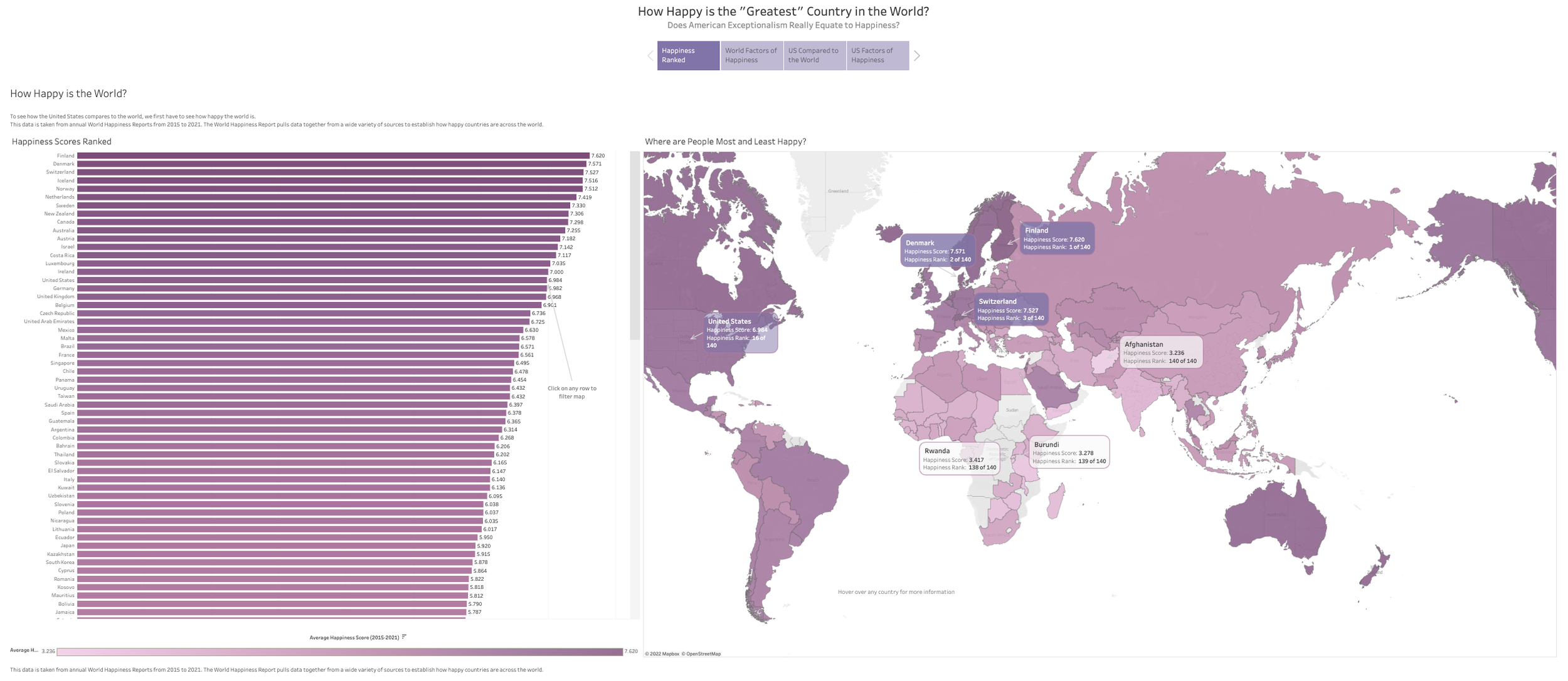
Finland is the happiest country based on an average of scores spanning 2015 to 2021, whereas Afghanistan is the least happy.
The most happy countries rank highly in all of the six contributing factors (GDP, Social Support, Health, Freedom, Generosity, and Lack of Perception of Corruption) but GDP, Social Support, and Health correlate most strongly with happiness rank overall.
The US is not that happiest country in the world, it never even makes it into the top 10. However, it does stay solidly in the top 20.
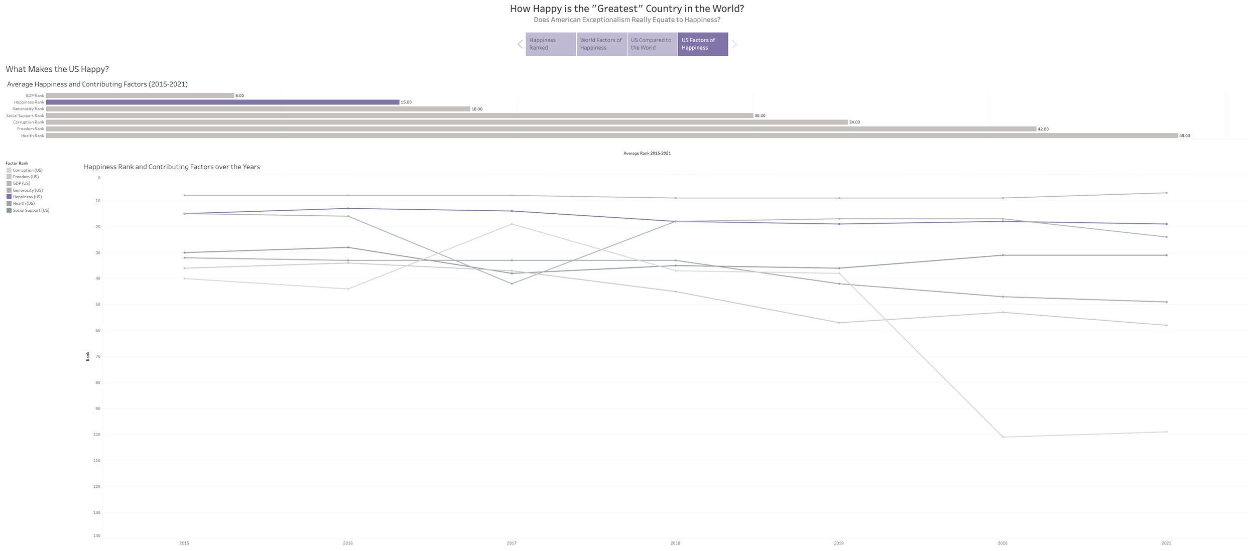
The US ranks consistently between 7th and 9th in GDP globally. However, the country ranks significantly lower on social support (average 30 of 140) and health (average 48 of 140).
The Final Design
The Process
Data Set Choice and Initial Exploration
I decided to work with World Happiness Report data because it provides a rich data set to play and I was interested to see:
Which countries are the happiest?
What factors contribute to happiness?
How has this changed since 2015?
Dataset Information
https://www.kaggle.com/mathurinache/world-happiness-report
Initial Exploration
I wanted to compare the different years, but this ended up being too ambitious for my early Tableau abilities. The data wasn't consistent, and 2020 in particular had many more fields. So, I ended up comparing the 2019 country scores with the various contributing factors. I paired this with a world map shaded by score. And I used the filter functionality so that the map filters the graph and the graph filters the map.
Defining a Narrative
When I tried to visualize this entire data set it didn't really tell a particular story, so I decided to focus in one element, or more specifically, one country: the United States.
I thought it would be really interesting to see how the myth of American exceptionalism fit with the reality of how the United States actually compares with the rest of the world.
I also wanted to show the trend over time for the happiness scores.
Sketches and Mockup
I next sketched out some possible presentations.
All the Data
Showing the trends for all the countries but making America stand out.
Select Data
Comparing the United States with lowest and highest scores.
Dashboard
Then a dashboard combining these ideas and also featuring vignettes of the factors that contribute to happiness.
Mock-Up
I decided to try to create the visualization of all the countries with the US highlighted. I created a visualization in Tableau and mocked up the other details in Sketch.
Tableau Story (2015-2020)
I decided to finalize this in a form a Tableau story. For happiness score and rank, I decided to show all the countries compared to the United States. Although this may seem overwhelming, the intent is not to show each individual data point but to give an impression of just how many countries were in the data set and where the US sits in comparison. I then presented charts on each of the six contributing factors (GDP, Social Support, Health and Life Expectancy, Freedom, Perception of Corruption and Generosity). For each of these I simplified and showed the US against the happiest countries and the countries with the highest ranking countries for that factor.
Revisiting in 2021
Further along in the certificate course, I decided to revisit this data set with new found data and visualizations skills, and with an additional year in the data set. I was further curious to see how the pandemic had changed the results.
Google Sheets Visualization
For this first, I did a simple stacked rank of the average happiness score for all of the countries from 2015 to 2021. I changed the color of the US so that we can clearly see how it compares to the rest on the world.
Dashboard
To represent the 2015-2021 data, I produced a dashboard showing a comparison of all the factors that contribute to happiness, a world map showing happiness by color, and a version of the happiness scores over time chart highlighting the United States.
Final Tableau Visualization
For this piece I took the best of the 2015 to 2020 story and the 2015 to 2021 dashboard and combined them focusing more on the narrative of exceptionalism.
I decided to start the story with the context of the average ranking of happiness across the world represented in both a bar chart and a map. The map can be filtered using the bar chart and each country can be hovered over for more information.
Happiness Ranked
I decided to start the story with the context of the average ranking of happiness across the world represented in both a bar chart and a map. The map can be filtered using the bar chart and each country can be hovered over for more information.
World Factors of Happiness
I liked the story that the factors chart from the 2015-2021 was telling, but it was too busy to read, so I broke it out into small multiples, one for each factor.
US Compared to the Rest of the World
This page revisits the US's happiness rank relative to the world over time. I used the Tableau "highlight" function so that the US would stand out and added call outs to the US's highest and lowest ranks, as well as labelling the actual happiest country (which are more visible when the highlighting is removed, which the user can do in the filter panel).
US Factors of Happiness
The final page is a deep dive into how the US ranks for the contributing factors to happiness, showing both the average scores ranked and the scores over time. We can see that the pandemic correlated with a major increase in perception of corruption


