CodeNiffler.com
Project: Redesign of personal portfolio website for developer, Katherine McClintic, AKA CodeNiffler
Elements: Visual Design | Branding | Character Design |Information Architecture
Where: Personal Project

Summary
CodeNiffler.com
CodeNiffler.com is the future personal portfolio website of backend developer, Katherine McClintic, which will replace her current website, http://www.katherine.tech/. A niffler is a fictional creature that relentlessly burrows in the dirt for hidden treasure. Katherine identifies with this creature because in her code she relentlessly searches until she finds the solution, so she chose the domain CodeNiffler.com to embody this ideal in her new personal website.
The Problem
Katherine has grown out of her current website that she put together when she was just starting out as a developer and job hunting. Several years on, she is now an established developer and wants a website that reflects where she is in her career now. Outside of work, Katherine is a director for Woman Who Code DC and wants a website that says less "hire me!" and more "learn from me!". A place where she can contribute to the tech community by sharing her knowledge and experience through blog posts and tutorials.
The Process
The Solution
I created a visual identity for CodeNiffler.com that includes a niffler mascot that expresses personality, humor, and fun. I simplified the mascot into a logo. I also created a wordmark that balanced fantasy (in keeping with the niffler) with the legibility and seriousness appropriate for someone wanting to be an authority. I created a clear information architecture for the site, and used a color scheme and layout that also balanced personality with an air of authority.
The Final Design

Landing Page - Final Visual Design

Blog - Final Visual Design

Presentations - Final Visual Design

About - Final Visual Design
The Process
Discovery
This project began with looking at Katherine's existing website, Katherine.tech, understanding what she did and didn't like, then understanding who she is as a developer, as well as what image she would like to portray.
Katherine.tech - Hire Me!
Katherine.Tech, Katherine McClintic's Current Website
Katherine's current website is very much a resume website, that screams "Hire me!". Because of this resume style, it makes her seem much more junior than she is. The site looks like a cluttered one page website, even though it actually has multiple pages, making it very easy to miss that she even has blog posts.
Katherine likes the color scheme of her current website and the tidbits of personal information that add personality, such as "What am I listening to" and "What am I reading". She also likes that people can see who she is, literally through the photo and figuratively via the personality infused into the content.
Audience for CodeNiffler.com
CodeNiffler.com is mostly aimed at Katherine's peers in the tech community, whether they are already established in tech, just starting out, or thinking of getting into tech. People might come to her site because they are searching for the answer to a specific problem that Katherine has written a blog post on, because the link has been shared as a resource, or maybe because she is speaking at a conference and people are curious to learn more about her.
Who is Katherine McClintic AKA CodeNiffler?
Katherine is a complex, multi-faceted person, but with any branding project (even that of a person) we have to boil that complexity down to something that is simple enough to resonate with the audience. While discussing this project, what kind of work Katherine enjoys, and what her colleagues think of her, three key principles came through: Research, Fix, and Teach.
Research: Katherine loves digging through a codebase to find the crucial piece of information that allows her team to complete their task.
Fix: Unlike many developers who like to build shiny new things, Katherine loves working in the constraints of an existing codebase, finding problems and fixing them.
Teach: Once she has done the research and fixed the problem, she synthesizes this so that her colleagues can benefit from the work she has done without having to do all the digging.
Mascot Creation
Why Have a Mascot?
Mascots are relatively common in tech. One great example is GithHub's Octocat, shown below. Mascots add personality, memorability, and make people feel personally engaged with a website. And because they are so common in tech, it is very on theme to include one on a tech website.
GitHub's Octocat © 2020 GitHub, Inc.
I felt that having a mascot would give Katherine's website the touch of humor, personality, and fun that she is looking for. Besides, with a name like "CodeNiffler" how could we not have a niffler?
Finding Inspiration
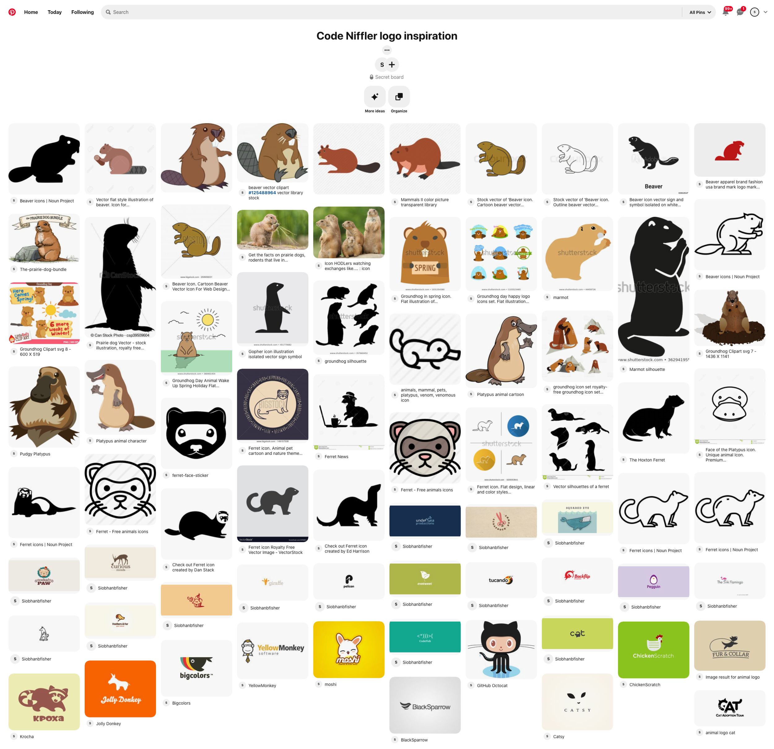
For inspiration I put together two Pinterest boards of images. A niffler resembles a cross between a ferret, a platypus, and an echidna, so the first board featured images of these and other real life animals, as well as other people's interpretations of nifflers. I also included some images of gems for the niffler to interact with because nifflers like shiny things and because Ruby is the name of a programming language Katherine works in. The second board featured mascots and animal icons for inspiration on how to simplify animal images to level needed for the CodeNiffler mascot.


Sketching
Then I started sketching. Throughout, I tried to imagine how the mascot may be paired with a wordmark to form a logo.


I then refined these sketches down to three more detailed sketches.

Nerdy Niffler

Niffler Silhouette

Sneaky Niffler
Moving to Illustrator
For the first iteration, I decided to go with a variant of sneaky niffler. I liked the idea of him interacting with the wordmark by trying to steal one of the letters.
Niffler Mascot First Version
Although some things are successful in this design, ultimately it was too visually complex to work as a logo. Further, the positioning does not make sense for a stand alone more detailed mascot.
I went back to the drawing board, figuratively and literally, and created a mascot that wasn't also trying to be a logo and that would be more versatile for use across the site
Niffler Mascot Second Version
In the process of creating the logo from this mascot, I discovered some further simplifications, so here is the final version.
Niffler Mascot Final Version
Logo and Wordmark Creation
Logo
I took the second draft of the mascot shown above and tried to scale it back to the level of simplicity that would work at the size of a favicon (i.e. 16 x 16 pixels).
Niffler Logo Experiments
In the above experiments, the glasses were too fussy, as was the open beak, and the three dimensional profile of the gem wasn't reading. So, in the final version I simplified these things, and had the gem extend beyond the circle so that it reads as a gem.
Final Niffler Logo
I decided that these simplifications would also benefit the mascot, and incorporated them as shown above.
Wordmark
With the wordmark I tried to represent the juxtaposition between code (with, for example, monospace fonts) with the more fantastical, magical creature, niffler side, all while also balancing legibility and personality.
CodeNiffler Wordmark Experiments
In the end, Katherine preferred both a subtler sans-serif monospace and fantasy font, with the motion carried through both words, similar to number 10. Here is the final wordmark.
CodeNiffler Final Wordmark
Information Architecture and Wireframes
CodeNiffler.com needs to be much less "here is what I have done" and more "here is what I can teach you." Thus, we decided to almost entirely remove the resume element and shift the focus to sharing information.
For CodeNiffler.com I designed four basic pages:
Landing page
Blog Posts
Presentations and Tutorials
About Me
Within these pages I needed to also find a home for the following content:
Social Media Links and Contact
Conferences Spoken At
Some Personal stuff (potentially visual such as photos)
And of course, the Niffler!
I started the process by quickly sketching out lots of different home pages.
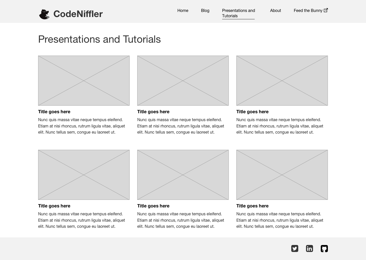
Then I refined the preferred approach into wireframes.
Because one of the issues with Katherine's previous website was that the blogs and other content were almost entirely hidden, I wanted to make sure that the information architecture for CodeNiffler.com made it clear what this site is about and where to find everything. I did this by pairing an essentially decorative home page, which is entirely navigation and makes it very clear what kind of content is available, with the navigation bar along the top of the screen that is consistent and present on every screen.
Landing Page Wireframe
Blog Wireframe
Presentations Wireframe
About Wireframe
Visual Design
When discussing what kind of personality Katherine wants her site to express, the recurring theme was balance. She wants to show some personality, in particular a sense of humor, but not too much. She wants people to get the sense that she takes things seriously but is not rigid. I wanted the visual style of the website to speak to this balance with a design that is mostly serious, but also colorful, a little playful, and definitely not boring.
For my first attempt, I played on the bright colors design trend. However, this was too bright for Katherine. Further, the gems no longer read as a rubies.
Colorful Visual Design Experiment
Instead, we decided to keep the gems ruby red, and pair them with a more subdued teal. I put the gems at irregular angles creating motion to move the eye around the page, and of course, included the all important niffler. "Feed the Bunny" is one of Katherine's personal projects, and since it is an external link I represented it as a rabbit walking out the door.
Landing Page - Final Visual Design
For the blog screen, I decided to use previews, so the viewer can quickly scan through to see anything of interest to them and then click into a detail page, as opposed to having to scan through an entire blog post before seeing what the next one is about.
Blog - Final Visual Design
For the presentations, I used a three column grid to give the viewer a compact, but not overwhelming, overview of the available content.
Presentations - Final Visual Design
And finally, for the about page I used a two column to show conference appearances and the about text without having to scroll. I positioned a niffler next to Katherine's photo to draw the eye, and put her contact information clearly visible below.
About - Final Visual Design
The header and footer are consistent throughout all these pages so the viewer can easily navigate around the site and will always have access to the social media links.


